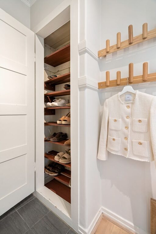
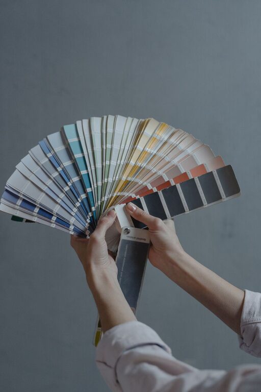
Creating a calm and inviting atmosphere in your home often starts with the colours you choose for your walls and décor. Calm colours can promote relaxation, reduce stress, and make your living spaces feel more comfortable. Whether you’re refreshing a single room or planning a full home makeover, selecting the right calm colours can transform the mood and energy of your space. Here are some helpful tips to guide you in choosing calm colours for your home.
Why Choose Calm Colours?
Before diving into specific colours and ideas, it’s useful to understand why calm colours matter. Calm colours generally have a soothing effect on the mind and body. They can:
– Lower stress levels
– Improve focus and concentration
– Encourage restful sleep
– Create a welcoming environment for guests
In contrast to bold or bright colours that energize or stimulate, calm colours promote peace and tranquility. This makes them ideal for bedrooms, living rooms, bathrooms, and even home offices.
Popular Calm Colour Palettes
1. Soft Blues and Greens
Blues and greens are classic calm colours inspired by nature—think of the sky, ocean, and forests. Their cool tones are refreshing and serene.
– Soft Blue: Great for bedrooms and bathrooms, soft blues evoke a sense of calm and clarity.
– Sage Green: This muted green adds a gentle natural feel without overwhelming the space.
– Seafoam Green: Light and airy, seafoam green pairs well with white or light wood accents.
2. Warm Neutrals
Neutral shades with warm undertones create a cozy and inviting atmosphere without feeling cold or stark.
– Beige and Taupe: These timeless tones work well in living rooms and dining areas, offering warmth and versatility.
– Soft Greige: A blend of grey and beige, greige is modern but soft, perfect for a calm yet contemporary look.
– Creamy White: Warmer than pure white, creamy shades keep rooms feeling light but comfortable.
3. Muted Pastels
Pastel shades are generally light and soft, making them naturally calming when used correctly.
– Lavender: A gentle purple that encourages relaxation and is especially popular in bedrooms.
– Blush Pink: Soft pink tones add warmth and comfort, ideal for nurseries or quiet sitting areas.
– Pale Peach: This subtle hue adds a touch of energy without overwhelming calmness.
Tips for Choosing Calm Colours for Your Home
Assess Your Space and Lighting
Lighting plays a significant role in how colours appear. Natural light can make colours look brighter and more vibrant, while low light may deepen or dull them. Before committing to a colour:
– Test paint samples on your walls.
– Observe how the colour changes throughout the day.
– Consider the direction your room faces (north-facing rooms tend to have cooler light, south-facing warmer).
Limit the Number of Colours
Too many different colours can create visual chaos, which defeats the purpose of a calming palette. Stick to two or three main colours, including neutrals, to maintain harmony.
Use Colour to Define Zones
In open-plan spaces, calm colours can help define zones while keeping a peaceful overall feel. For example:
– Use a soft blue in the living area.
– Choose a warm taupe for the dining space.
– Incorporate muted pastels in reading nooks.
Balance Colour with Texture and Material
Colour is only one aspect of creating calm. Combining your chosen colours with natural materials like wood, linen, and cotton enhances the soothing effect. Soft textures and organic elements make rooms feel more comforting.
Consider the Purpose of Each Room
Think about how you use each space and what atmosphere you want to create:
– Bedrooms benefit from cool and restful colours like pale blue or lavender.
– Living rooms work well with warm neutrals and soft greens for a welcoming ambiance.
– Home offices may require colours that calm but also stimulate focus, such as muted green or grey.
Avoid Overly Saturated Shades
Bright or highly saturated colours can be overpowering. Opt for softer, muted tones that blend well with natural light and other design elements.
Complement Calm Colours with Appropriate Decor
To enhance calmness, pair your colours with matching decor choices:
– Use light-coloured curtains or blinds to soften sunlight.
– Choose minimalistic furniture with smooth lines.
– Incorporate plants to add a natural, refreshing touch.
– Use soft rugs and cushions to add warmth and texture.
Final Thoughts
Choosing calm colours for your home is about creating balance and harmony in your living space. By understanding lighting, limiting your colour palette, and considering each room’s purpose, you can select shades that promote peace and relaxation. Remember that softer blues, greens, warm neutrals, and pastel shades are reliable options to start with. Don’t forget to test your samples in the actual space before making your final decision, and complement your chosen colours with natural textures and decor.
With thoughtful choices and a little planning, your home can become a tranquil haven where you can relax and recharge every day.
About the Author